Friday March 1st was the deadline for our rough edit. This meant I had to finish the retakes of shots that did not go so well the first time and then collect a draft of our soundtrack which we recorded at the start of the week. Some of the shots that had to be re done consisted of the pan of the room (where I used the rubber band trick to make it smooth and steady), the shot of the door, and finally shots of the various posters that were used as homage of iconic femme fatale films.
I then uploaded everything back onto the computer and imported it into Final Cut, so I could incorporate it in my draft. I found the draft editing process insightful as it made me fully understand how long it takes to edit roughly 2 minutes of footage!
However, I had some difficulties with my titles as one of them kept appearing minute on the video but regular size when not on Final Cut. Therefore I had to go back on to Live Type, which is the program I used to create my title sequence, and make it larger. I then decided to increase the size of all my titles, as well as change the time span they appeared on screen for.
After about 45 minutes of frustrating titles, I then imported the new ones into Final Cut and replaced the old ones in my sequence.
Finally, I inserted the soundtrack we made and the Foley sound of the hanger swinging to give myself a rough idea of what the opening looked like with the soundtrack included.
I now have to focus all my attention on learning how to make the footage black and white, with the key colours enhanced. I look forward to completing my final edit.
Showing posts with label Titles. Show all posts
Showing posts with label Titles. Show all posts
Monday, 4 March 2013

Friday, 15 February 2013
Evaluating the titles
Having finished our title sequence I would like to reflect back on the process and point out improvements and what went well.
Improvements:
1. We made the titles all in one sequence which made it difficult at first to separate them in Final Cut because they appeared individually between the shots. However, I got shown how to select them in their own frames and pace them in the relevant places that i coordinated with the arrangement of them on our storyboard.
2. They look quite simplistic which can be seen as good and bad. Good, because it looks professional and we wanted it simple and effective which we feel we have achieved. We did not want to over do it and exaggerate everything just to show off skill, because then it may have turned out tacky. However this can be seen as bad because we haven't showed what we can do when it comes to making titles and in a sense they can look restricted compared to what we could have done.
What went well:
1. It was a new process that I had not done before and i thoroughly enjoyed making them. I picked up a new skill whilst having fun putting together my footage.
2. We made a few drafts and were forever changing elements of the sequence before we made one which we all thought was the one. We went from changing the background colour, to the font, to the effects and even the colour of the text itself. Initially we had a different effect for each title and then realized we needed to keep it the same if we wanted to have continuity which would ultimately look more effective.
Here is our completed title sequence:
Improvements:
1. We made the titles all in one sequence which made it difficult at first to separate them in Final Cut because they appeared individually between the shots. However, I got shown how to select them in their own frames and pace them in the relevant places that i coordinated with the arrangement of them on our storyboard.
2. They look quite simplistic which can be seen as good and bad. Good, because it looks professional and we wanted it simple and effective which we feel we have achieved. We did not want to over do it and exaggerate everything just to show off skill, because then it may have turned out tacky. However this can be seen as bad because we haven't showed what we can do when it comes to making titles and in a sense they can look restricted compared to what we could have done.
What went well:
1. It was a new process that I had not done before and i thoroughly enjoyed making them. I picked up a new skill whilst having fun putting together my footage.
2. We made a few drafts and were forever changing elements of the sequence before we made one which we all thought was the one. We went from changing the background colour, to the font, to the effects and even the colour of the text itself. Initially we had a different effect for each title and then realized we needed to keep it the same if we wanted to have continuity which would ultimately look more effective.
Here is our completed title sequence:
Creating the titles
The making of our titles was put together through Live Type and After Effects. We begun to work on Live Type by picking the colour of the titles and then sifting through various effects to add to them. We then started positioning them in different places on the page. We used our real first names but then made up the last names amongst other names to add to the titles.

This screengrab shows the text used for one of the titles; 'Furor', and the effect we have chosen to use throughout our title sequence which is 'Lurch'. We used this for all of them as it created a sense of continuity and looked more professional. It was interesting going through all the effects to find one that we thought matched the theme of our thriller opening. This particular title related to our audience because it came, hovered, and then disappeared which can be seen as eerie. As the titles are the first shot the audience will see, we wanted them to have an impact. it looks quite effective when they come and go in between shots of the woman in her room.
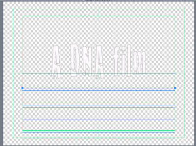
This screengrab shows one of our opening titles which is the Production company. It was placed in the center of the screen as it was the first title to appear so we wanted it to be big. The others are considerably smaller.


These two screengrabs show two of our titles 'Costume' and 'Casting'. I have included two here to show the variation in positioning of our titles. These sreengrabs were taken from Live Type before we exported the final title sequence.


We chose to have our titles appear in front of a black background. Not only did this create simplicity, but it emphasized the white text which was ironically used.This echo's the white dress the woman was seen wearing which contradicts her personality, as it becomes apparent that she is not innocent and pure like the connotations of white suggest.
Most of the inspiration for our title sequence came after watching various title sequences of films such as Psycho and Se7en which is the one we favoured.
I took some screengrabs showing particular parts of the opening sequence that we took into account, liked, and then altered.

This screengrab shows the effect of the text and the font used. We used a similar one as the hovering on the screen suited our theme; it was unstable just like the woman's mindset. However, the titles for Se7en were not all over black backgrounds, unlike ours which we thought showed consistency.

The reason for this screengrab is that it shows where we got the idea of the black background from, which Kyle Cooper initially created for David Fincher's Se7ev (1995). This then influenced a whole host of designers and still remains common for titles that use text over a black background. This also shows their use of two titles on one shot which we decided not to do so that the focus was on individual titles.
Here is the opening title sequence for Se7en:

This screengrab shows the text used for one of the titles; 'Furor', and the effect we have chosen to use throughout our title sequence which is 'Lurch'. We used this for all of them as it created a sense of continuity and looked more professional. It was interesting going through all the effects to find one that we thought matched the theme of our thriller opening. This particular title related to our audience because it came, hovered, and then disappeared which can be seen as eerie. As the titles are the first shot the audience will see, we wanted them to have an impact. it looks quite effective when they come and go in between shots of the woman in her room.

This screengrab shows one of our opening titles which is the Production company. It was placed in the center of the screen as it was the first title to appear so we wanted it to be big. The others are considerably smaller.

This timeline of our opening sequences shows each individual title and the duration it is on the screen for. We chose to have one title per frame to allow the titles to hover by themselves before it led into the shot.

These two screengrabs show two of our titles 'Costume' and 'Casting'. I have included two here to show the variation in positioning of our titles. These sreengrabs were taken from Live Type before we exported the final title sequence.


We chose to have our titles appear in front of a black background. Not only did this create simplicity, but it emphasized the white text which was ironically used.This echo's the white dress the woman was seen wearing which contradicts her personality, as it becomes apparent that she is not innocent and pure like the connotations of white suggest.
Most of the inspiration for our title sequence came after watching various title sequences of films such as Psycho and Se7en which is the one we favoured.
I took some screengrabs showing particular parts of the opening sequence that we took into account, liked, and then altered.


The reason for this screengrab is that it shows where we got the idea of the black background from, which Kyle Cooper initially created for David Fincher's Se7ev (1995). This then influenced a whole host of designers and still remains common for titles that use text over a black background. This also shows their use of two titles on one shot which we decided not to do so that the focus was on individual titles.
Here is the opening title sequence for Se7en:
Subscribe to:
Posts (Atom)