After weeks of preparation including, looking at thriller sub genres, thriller conventions, thriller openings and title sequences, my group and I finally filmed our thriller opening. We collected the relevant equipment from the media pod and then met at a friends house to film in her bedroom.
Setting:
We needed a particular setting with a windowsill, bed, and wardrobe and her room fitted this criteria. We also opted for somewhere local in the event that shots needed to be re done we didn't have to go far and also, we could easily change her room back to how we needed it, where as if we were outside the picture may have changed and would not be exactly how it looked in the initial shots.
Props:
Some of the props included;
- A white dress to signify innocence and purity
- A purple dress to signify power
- A trenchcoat, cigarette and whiskey which are iconic film noir props
- Homage from Silence Of The Lambs being the motivational words on the back of the door
- Homage from famous femme fatale films being the posters on the wall from Fatal Attraction, The postman Only Rings Twice and Double Indemnity.
- Red lipstick and nail polish were used to create a sense of the woman being provocative, flirtatious but also dangerous.
-Empty photo frames and an upside down clock to raise questions
Filming:
After perfecting the setting an setting up the props, we began filming our first shots. We already knew this would be a challenge, as Nikita who was acting, is not easily able to get into character and keep a straight face, this is something we established when making our preliminary video. However Nikita soon got to grips with what she had to do and filming was underway. The first couple of shots worked well although admittedly were not shot in the first couple of takes, but it was okay because the practice helped us to improve. One shot that took particularly longer then the others to film was shot 3 where Nikita was applying the lipstick. This was due to a variety of reasons, from the lighting being off, to Nikita smiling or laughing and consequently having to wipe off the lipstick ready to reapply it in the next take, I think it was take 8 that we eventually got the footage we needed! Myself and Andrew took it in turns to film the shots and used a variety of angles from extreme close up to panning, to eye level and even point of view shots. Once we got into the swing of things everything started falling into place and we managed to do a few of the shots in just one take. I really enjoyed experiencing what it was like to film the opening especially as it was something we had put together over the weeks, it was great to see it come to life. We all had fun on set and behind the scenes which made it an easier working environment. The tripod was a lifesaver, we were able to film exactly what we wanted to see in the shot without the filming being shaky, which was greatly appreciated.
Lighting:
We closed the curtains in the room and switched off the light to create a dark and eerie atmosphere to mirror the mindset of the woman. We used a led light that we got from the media pod to shine on the shots when being filmed. for example, when Nikita was applying the lipstick, the light was on her face emphasizing what she was doing, additionally when the purple dress was shot in the wardrobe the light was on it to show the significance of the colour but also to brighten up the shot without having the whole room lit.
Pictures:
Throughout the shooting period, we all took the opportunity to take some pictures of Nikita in costume, but also of the set once it was laid out how we needed it to be, and also of each other filming and using the equipment.

This is a picture showing a trench coat and a rope. The trench coat in particular is a iconic prop in film noir so we made sure this was visible in some of our shots. The powerful words are a homage of those used in Silence Of The Lambs. They are seen on the tree as the woman is training in the woods. Our words reflect aspects of the main character. She uses sex to get what she wants and therefore is a
powerful who inflicts
pain on her selected targets. The words
fatal and
attraction were another homage of the film Fatal Attraction. below is a screenshot of the words on the tree that i took from the opening of Silence Of The Lambs to show where the idea originated from.
This is a poster of Glenn Close who starred in Fatal Attraction. This was another homage of the film, used for two reasons. The first, was that it was 1 of 3 posters of femme fatale's on the wall of this woman's room as their characters are similar to the woman we were trying to portray. Secondly, this poster was significant in the scene because there is a panning shot showing the main character copying this shot which looks creepy and creates an eerie atmosphere.
This is another poster of an iconic femme fatale. Lana Turner starred in The Postman Only Rings Twice. once again this poster was included in a panning shot before we see the woman mimicking the pose Glenn Close acted. The fact that this is black and white is also important because we ave decided that our thriller opening is going to be black and white, and it shows that this was common in the genre film we have chosen.
This was a simple shot showing the clock at 12:12pm. The point of this shot was to show the exact time which supposedly reflects the precision of the woman and emphasizes her particular lifestyle. also, it was purposely upside down to raise questions and ignite suspicion, because why would you have an upside down clock?
This picture of the empty photo frames is again to raise questions. Not only is it peculiar to have empty photo frames, but it suggests the fact that maybe this woman is alone, and in fact has no loved ones to put inside the photo frames. Or she could simply have purposely kept them empty, which again is an abnormal thing to do. This does however provide us with an insight into the characters life.
This was a newspaper we made so that the title actually had significance in the shot. The title being 'Local millionaire wins millions on Saturday's lottery'. This shows the intention of the woman as she circles the mans face. We purposely chose to have a millionaire win the lottery because its someone who has more then enough money, and who has won even more! This is believably the reason she has targeted him, because she is in a poorer position and he has won money he doesn't even need.
We chose to have a purple dress to signify mystery and power. This is the dress the woman grabs before leaving to track down this millionaire lottery winner to get what she wants from him. The dress was purposely hanging by itself to show the lack of clothes she has as well as to highlight the importance of this one dress. The dress is short and revealing which supports the idea that she uses sex to get what she wants, and is essentially a provocative character.

This is a picture of myself positioning the camera ready to start recording the next shot. Nikita was the only actress in our film opening, and myself and Andrew took it in turns to film. I really enjoyed filming as I had never done anything like this before (other then our preliminary) but this was much more serious. I also became familiar with how to use the equipment properly which will help me in future media lessons. The girl in the background is my friend Alisha who allowed us to use her room to film, she was also taking pictures on her phone of the set and us using the equipment.
Here, we were just abut to start filming the opening shot. We used the board to help us keep track of what shot we were on and also how many takes we had done. This also helped us when it came to uploading the footage onto the computer as it was easy to rename the files because we could easily see what shot the footage was of because of the board.
Myself and Nikita were watching back a shot we had just filmed to check it was okay, before moving onto the next scene.
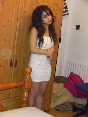
Nikita is sitting here in costume between shots. She was ironically wearing a white dress as it contradicted the woman's character. White symbolizes purity and innocence which are two things our character is not. We purposely did this amongst other things because we wanted to undercut expectations and stereotypes.
This picture shows Nikita practicing the scene where she is copying the pose Glenn Close did in the poster. This is quite a creepy shot and raises questions of why she is copying the poster exactly. Also the panning shot itself which we used to film this shot helped create an eerie atmosphere because the light is on her at the end of the shot and we don't expect to see her there, as it originally looks like a pan of the room.
Here is Andrew preparing to film one of the upcoming shots. Andrew, like me, enjoyed using the equipment to film our opening. We took it in turns to shoot which gave us both the opportunity to work with the equipment and experience filming, but also to sit back and watch the other one to see how they went about filming.


