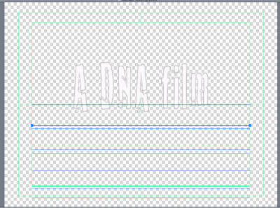
This screengrab shows the text used for one of the titles; 'Furor', and the effect we have chosen to use throughout our title sequence which is 'Lurch'. We used this for all of them as it created a sense of continuity and looked more professional. It was interesting going through all the effects to find one that we thought matched the theme of our thriller opening. This particular title related to our audience because it came, hovered, and then disappeared which can be seen as eerie. As the titles are the first shot the audience will see, we wanted them to have an impact. it looks quite effective when they come and go in between shots of the woman in her room.
This screengrab shows one of our opening titles which is the Production company. It was placed in the center of the screen as it was the first title to appear so we wanted it to be big. The others are considerably smaller.
This timeline of our opening sequences shows each individual title and the duration it is on the screen for. We chose to have one title per frame to allow the titles to hover by themselves before it led into the shot.
These two screengrabs show two of our titles 'Costume' and 'Casting'. I have included two here to show the variation in positioning of our titles. These sreengrabs were taken from Live Type before we exported the final title sequence.
We chose to have our titles appear in front of a black background. Not only did this create simplicity, but it emphasized the white text which was ironically used.This echo's the white dress the woman was seen wearing which contradicts her personality, as it becomes apparent that she is not innocent and pure like the connotations of white suggest.
Most of the inspiration for our title sequence came after watching various title sequences of films such as Psycho and Se7en which is the one we favoured.
I took some screengrabs showing particular parts of the opening sequence that we took into account, liked, and then altered.
The reason for this screengrab is that it shows where we got the idea of the black background from, which Kyle Cooper initially created for David Fincher's Se7ev (1995). This then influenced a whole host of designers and still remains common for titles that use text over a black background. This also shows their use of two titles on one shot which we decided not to do so that the focus was on individual titles.
Here is the opening title sequence for Se7en:


No comments:
Post a Comment